Data:
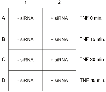
This data set is from an siRNA transfection experiment, in which the TNF-R (Tumor Necrosis Factor Receptor) is knocked down by siRNA.Assay:
Cells are first transiently transfected with siRNA specific to TNF-R.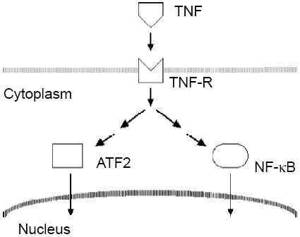
There are a lot of downstream effectors in the TNF signaling pathways. We are only looking at 2 of the downstream effectors; hence, a much simplified diagram is drawn here. One target is NF-kB, which moves from cytoplasm into nuclei when it becomes activated. The other target in this experiment is ATF2, also a transcription factor. It also moves from cytoplasm into nuclei when stimulated.
Cells are then treated with TNF for 0, 15, 30, and 45 minutes before being fixed and processed for examination.
Readout:
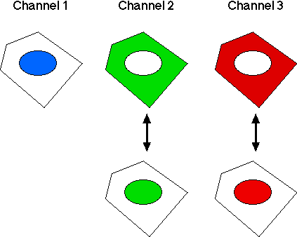
Three cellular parameters are monitored:- Channel 1: DNA stain (for identifying nuclei).
- Channel 2: NF-kB. We are interested in its cytoplasm-to-nucleus translocation.
- Channel 3: ATF2. We are interested in its cytoplasm-to-nucleus translocation.
Numbers of Cells in Wells
Let's first take a look at the numbers of cells in the wells and paint those cells untransfected with TNF-R siRNA green and those cells transfected with TNF-R siRNA red in the following 18-second video:.The 2nd Channel, NF-kB
We'll next take a look at the cytoplasm-to-nucleus translocation of NF-kB in cells in all wells in the following 8-second video.It is clear that NF-kB becomes activated quite early on
after TNF treatment. Its level in nuclei stays high even
after the 45 minutes of treatment. We can easily see here
that the nuclear translocation of NF-kB in those cells transfected
with the siRNA is reduced quite a lot.
The 3rd Channel, ATF2
We'll take a look at the cytoplasm-to-nucleus translocation of ATF2 in cells in all wells in the following 9-second video.The level of ATF2 in nuclei also jumps up quite fast but
obviously its increase in nuclei is more transient,
compared with NF-kB.
We can see that its level in nuclei goes down quite a lot
at the 45 min time point.
Point to Ponder
Since siRNA transfection is not homogeneous, does it make sense not to examine subpopulations of cells with altered responses?We all know that the transfection efficiency in siRNA experiments is never 100%. That is why people call it siRNA knockdown, not siRNA knockout. Let's take a look at the boxplot of NF-kB translocation again. We can see that the NF-kB translocation of red cells in wells B2, C2, and D2 is suppressed. but it is never as low as that of untreated cells in A1 and A2. Why is that? Because now wells B2, C2, and D2 contain mixed populations of cells. Some cells still respond normally to TNF but some don't. Those cells that don't respond to TNF normally have their TNF receptors knocked down more. Can we examine those cells to see what happened to their other downstream effectors? Sure, with Panmo, it is quite easy to do so.
Exploring subpopulations of siRNA-Transfected Cells
Here we are going to visualize the data in the boxplot of NF-kB translocation from a different viewpoint by making a trellis graph of histograms. After that, we'll take out all the siRNA-transfected cells in a well and explore how ATF2 was affected by the siRNA and how NF-kB and ATF2 relate to each other.- First, make a trellis graph of histograms of NF-kB translocation,
as illustrated in the following 15-second video:
- Next, we are going to take out all the cells in the B2 well.
All cells in this well were transfected with this TNF-R siRNA.
2 steps to achieve this, as illustrated in the following 8-second video:
- Now we have all the cells in the B2 well.
Let's divide them into 2 groups: those cells
with low NF-kB translocation and
those cells with high NF-kB translocation.
We'll do so with Panmo's paint brush.
NF-kB low responders will be painted blue.
NF-kB high responders will remain red after the painting operation.
The following video runs for 9 seconds.
- Let's compare the ATF2 translocation of NF-kB low and high responders
in the B2 well. Because the histogram panel plot in last video
contain all the cells in the B2 well,
we just get all the cells from it and make a boxplot with Observation color (blue for NF-kB low responders; red for NF-kB high responders)
as the X variable and ATF2 Translocation as the Y variable, as illustrated in the following 14-second video:It's clear from the boxplot at the end of last video that those cells with low NF-kB translocation also show low ATF2 translocation.
- Next we are going to explore how the ATF2 translocation relates to
the NF-kB translocation in B2 cells.
The histogram panel plot (the one obscured by the explanation panel
in last video) of NF-kB translocation in B2 cells is already
in the data retrieve mode.
We just retrieve all the data in that plot
to make the following scatterplot of NF-kB translocation vs. ATF2 Translocation:
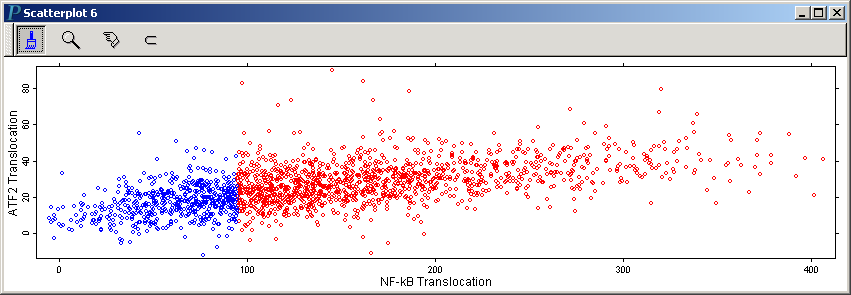 Note that we have resized this scatterplot to make the horizontal scale
roughly the same as the vertical scale. We can easily
add a lowess curve to this scatterplot to provide a visual abstraction
of the pattern in the point cloud. Do so by invoking Add Lowess Curve in the right-click menu of the scatterplot.
The following is the above scatterplot with a lowess curve added:
Note that we have resized this scatterplot to make the horizontal scale
roughly the same as the vertical scale. We can easily
add a lowess curve to this scatterplot to provide a visual abstraction
of the pattern in the point cloud. Do so by invoking Add Lowess Curve in the right-click menu of the scatterplot.
The following is the above scatterplot with a lowess curve added:
- Panmo's LIPS loop makes data exploration extremely easy.
In the last video, which runs for 29 seconds ,
we'll demonstrate pooling the data in
the B1 and B2 panels of the trellis graph of histograms
(at the end of the video in Step 3)
and examining the relationship between NF-kB and ATF2.