Parallel Coordinate Plot
Nickname: PCP
Arguments: Two or more numerical variables
Argument menu:
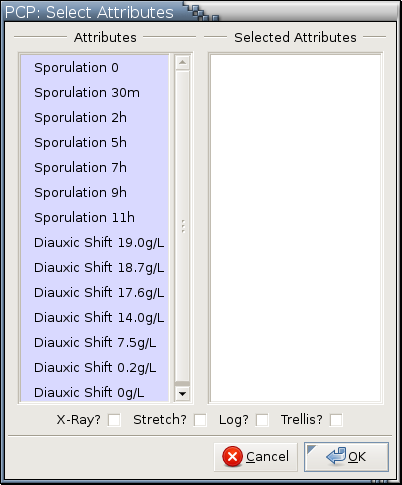
Example:
Only numerical variables are listed in this menu.
Variables have to be selected first before they can be moved between the left and the right columns.
Only variables in the Selected Attributes column are used to make a parallel coordinate plot. The top-to-bottom ordering in the Selected Attributes column is mapped to the left-to-right variable ordering in a parallel coordinate plot.
Variable ordering in the right column can be changed with drag and drop.
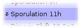
Selected variables are displayed over a slightly more saturated background, as illustrated in the following examples:

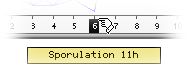
---> images/plot-pcp-arg-menu-unselected.png <--- ---> images/plot-pcp-arg-menu-selected.png <--- Variables are selected with Left , Ctrl-Left , and Shift-Left . See here for details.
Selected variables can be moved around with drag and drop, keyboard accelerators, and functions in the right-click menu that can be popped up over the 2 columns. See here for details.
If X-Ray? is checked, the resulting plot is drawn in grayscale where the brightness of a pixel encodes the number of observation profiles passing through it.
If Stretch? is checked, Each variable will use its own scale and the minimum and the maximum of the variable at an axis are mapped to the bottom and the top of the available drawing room.
If Log? is checked, the generated PCP or PCP trellis display is based on the log2 transformation of the selected variables.
If Trellis? is checked, a PCP trellis display will be drawn.
Available modes:
 ,
,
 ,
,
 , and
, and
 .
.
Housekeeping functions:
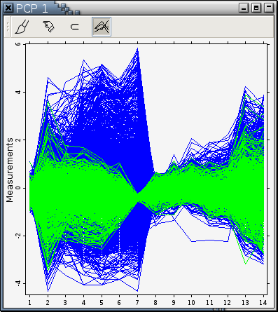
Example: Figure 11-9
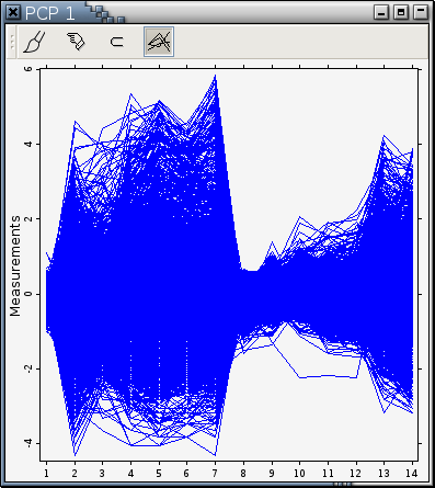
High-dimensional data are hard to visualize because we are used to a 3D world. Many visualization techniques have been developed to help visualize this kind of data. Most of them eventually map high-dimensional points onto 2D points for displaying on a flat surface. Parallel coordinate plots take a different approach to draw high-dimensional data. Since plotting more than 3 mutually perpendicular axes is impossible, parallel coordinate plots draw all the axes parallel to each other and equally spaced in a 2D plane.
For simplicity, 1 is adopted to be the distance between adjacent axes.
In this approach, a point in a p-dimensional space is represented as a series of line segments in a 2-dimensional space. Thus, if the original data observation is written as (x1, x2, ... xp), its parallel coordinate representation is the p line segments connecting the points (1, x1), (2, x2), ... (p, xp). This unbroken series of p line segments could be thought of as a profile of a given observation. The shape of the line segments conveys information about the levels of the p variables. Observations with similar data values across all variables will share similar profiles. Clusters of similar observations can thus be discerned. Associations among variables can also be visualized; two variables inversely proportional to each other will be connected by line segments which all cross in the region between the axes, while two directly proportional variables will be connected by parallel line segments.
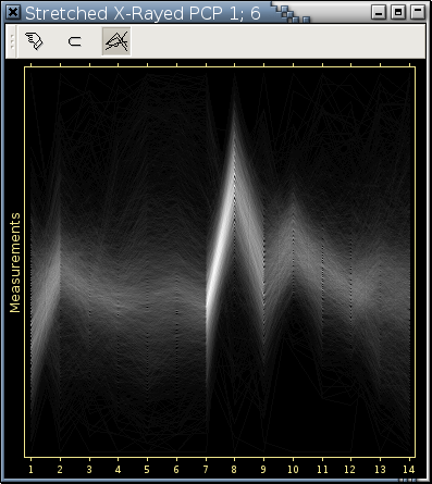
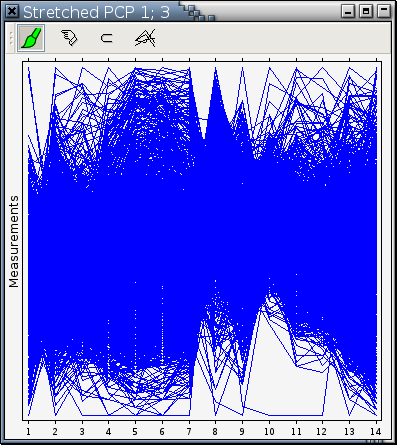
There are in general 2 ways to draw a parallel coordinate plot. One is to use a common vertical range that encompasses all the values of all the variables being visualized. Figure 11-9 is such an example. Parallel coordinate plots drawn in this way can convey relative magnitude of variable values. The other way is for each axis to use a different scale so that the minimum and the maximum values of the variable at an axis are mapped to the bottom and the top of the available drawing room. Parallel coordinate plots drawn in this way are called stretched in this manual and is good for detecting clusters visually. Figure 11-10 is a stretched parallel coordinate plot displaying the same data as Figure 11-9.
Overstriking can frequently be a problem for parallel coordinate plots. Each blue pixel in Figure 11-9 only tells you there is at least one observation profile passing through it. A blue pixel that appears only in one observation profile looks exactly the same as a blue pixel that appears in 1000 observation profiles. Argos provides several ways to detect overstriking in a parallel coordinate plot. For example,
Use the hand cursor in
mode. If the profiles in the hot spot in front of the
pointing finger spread out into many profiles in other
areas, there is definitely serious overstriking.
Paint a small area in a different color and see if profiles passing through this painted area spread out or no in some other areas.
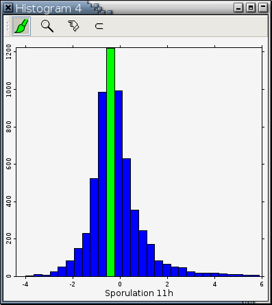
Use a histogram to take a vertical slice of a PCP. For example, the following histogram is based on the variable at Axis 7 [1] in Figure 11-9. The highest bar in the histogram was painted green to highlight the extent of overstriking in Figure 11-9. Notice how green profiles passing through Axis 7 spread out in other areas.
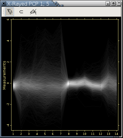
---> images/plot-pcp-sliced-histogram.png <--- ---> images/plot-pcp-sliced-painted.png <--- Draw a parallel coordinate plot in grayscale where the brightness of a pixel encodes the number of observation profiles passing through it. Redraw Figure 11-9 and Figure 11-10 in this way generated the following 2 plots.
Notice the internal structure and the x-ray like appearance of these 2 plots. More information on x-rayed parallel coordinate plots are here.---> images/plot-pcp-x-rayed-example.png <--- ---> images/plot-pcp-stretched-x-rayed-example.png <---