Boxplot
Arguments: One categorical variable and one numerical variable
Argument menu:
Example:
This argument menu allows the selection of 1 categorical variable as the X variable to be plotted along the horizontal axis and 1 numerical variable as the Y variable to be plotted along the vertical axis.
The "X Argument" column contains only categorical variables.
The "Y Argument" column contains only numerical variables.
If ME Ordering? is checked, main-effect ordering will be used, which means box graphs will be arranged in ascending order of medians of the Y variable from left to right.
If Log? is checked, log2-transformed Y variables will be used to draw a boxplot or boxplot trellis display.
If Trellis? is checked, a boxplot trellis display will be drawn.
Available modes:
 ,
,
 ,
,
 , and
, and

Housekeeping function:
Example: Figure 11-2
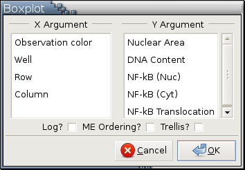
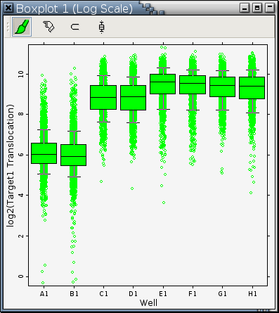
Figure 11-2 contains 8 box graphs. Each box graph corresponds to a category of the variable plotted on the horizontal axis. A box graph contains 5 horizontal lines, which, from bottom to top, represent the 10th, 25th, 50th, 75th, and 90th percentiles of the values of the variable plotted on the vertical axes. All values less than the 25th percentile or greater than or equal to the 75th percentiles are graphed individually as point icons. All values greater than or equal to the 25th percentile and less than the 50th percentile are grouped into the lower rectangle. All values greater than or equal to the 50th percentile and less than the 75th percentile are grouped into the upper rectangle.
The dimensions of the rectangles in a box graph has nothing to do with the number of observation objects they represent; it's the height of a component rectangle in a box graph that matters and represents the range of data values.